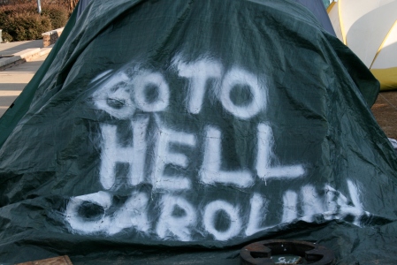
My mini-documentary on the 40th Anniversary of NC State’s Grains of Time…
NCSU Grains of Time 40th Anniversary Mini-Doc
March 19, 2009This short documentary style piece will cover the events of the 40th anniversary of NC State’s premier men’s accapella group. It will cover how the group’s music has evolved from folk to more top 40, and where they are today, culminating in the concert.
“Lost in Translation”
March 16, 2009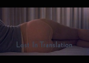
“Lost in Translation” is an interesting look at a foreigner’s prospective of Japan through the eyes of an actor and a wife of a photographer who are staying in the same Tokyo hotel.
The title plays an important role in understanding the meaning of the film. Ironically, the title got lost in translation, so to speak, in its foreign releases. Apparently the literal translation sounds more like a discussion on translation in other languages. As a result, the title ended up being something along the lines of “Lost in Tokyo”. That to me diminishes a large theme of the film: that many things can be lost in translation. Sofia Coppola chooses not to use subtitles for any of the foreign languages that appear in the film. That gives most viewers the feeling of Bob or Charlotte, who do not understand either. One of the best examples of that was in the hospital scene where an old Japanese man is trying to talk to Bob, who has no idea what the man is trying to say, and two Japanese ladies can be seen laughing at the two men’s ridiculous conversation. It is also apparent in the scene where the Japanese director is trying to instruct Bob in great detail, and the translator appears to water down the entire conversation to a simple word or sentence. The title, to me, gives the somewhat random plot, at times, some meaning. It framed it as sort of a satire on language/cultural barriers, and barriers in relationships as well. Without the title “Lost in Translation”, I would have struggled to find a meaning or purpose in the film. Otherwise, it would feel like an awkward romantic comedy of sorts between Bob and Charlotte.
To me, Sofia Coppola is a horrible actress (see Godfather Part III). This was my first experience with her writing/directing, and I was much more impressed by her attempts in these areas with “Lost in Translation”. She won an Oscar for original screenplay, and deservedly so. It is a very original/creative script, and I thought she had a cast and crew that brought it to life well. The story was written for Bill Murray (L.I.T. likely would not have been made had he declined the part), and I thought Scarlett Johansson complimented him well. Sofia, according to imdb.com, designed most of the shots for the film by shooting a series of photographs around Tokyo and then recreating them/using them as references while shooting the movie. I thought she did a great job setting the scene. Location was obviously an important element of the story, and the cinematography did an outstanding job showing Tokyo and visually embellishing the story. It needed to have some aesthetically pleasing elements because the plot moved somewhat slowly for a short feature film.
“Lost in Translation” had an independent film feel to it with a Hollywood name (Coppola) and cast (Murray/Johansson) behind it. It is a film that breaks the mold of a lot of recent films, and takes a lot of artistic risks in terms of plot. With about a $4 million budget, according to imdb.com, it was never meant to be a blockbuster. I liked that though because it allowed Sofia Coppola’s artistic vision to show through, and it was a genuine film that serves as a reminder for why movies are made. Too many modern studio films are marred by commercialism, but I thought this film resisted that trend, yet it was still rewarded with a profit at the box office and attention (as well as one win) from the Academy. I hope movies like this will continue to be made by the big studios, despite their minimal profits at the box office.
A Story, Children, is Just a Shot Away…
March 9, 2009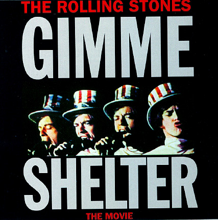 “Gimme Shelter” documents a 1969 Rolling Stones US tour that concludes with the infamous performance at Altamont. The style is very different from more contemporary documentary films. Part of that comes from the period. In 1970 they were using film cameras, and other relatively low- tech equipment by today’s standards. Those cameras give the movie a little different feel from the DV or HD video of today. I felt like, compared to a modern documentary, the edits were far more infrequent. They tended to stay with one show or one setting for long periods of time. It gave the feeling that the viewer was actually a part of the concert, not just someone watching a clip as part of a documentary. There are no voice overs, and minimal text on screen. The audience sees things through the band’s eyes, and through the crowd’s eyes. Then the viewer is left to interpret what happens, the filmmakers do not do it for them. In particular, the shots behind Mick Jagger where the audience comes in and out of focus, put things in perspective.
The Maysles also do an outstanding job of setting the scene. The crowd shots and reaction shots of the band members watching the rough cut are captured perfectly. That, again, contributes to the feeling that the viewer is a part of the concert and also the band’s entourage. It really almost felt like a 90 minute trip watching the movie because of how well they set the scene.
What the filmmakers essentially did is make a “Rolling Stones LIVE in 1969” video, but they chose to make it in a way that leads viewers to a message about what happened at Altamont. In today’s world of short attention spans, I think it might not work as well. All the essentially raw footage that was cut together to make a movie bothered me a little, but that is probably due to the fact that I grew up with the modern documentary that is vastly different. I prefer more interviews and a structured message, but the unique style in “Gimme Shelter” that allows the viewer to form conclusions is a very interesting way to make a documentary. I feel like it was very effective for The Rolling Stones/1960s because of how visual the era was, but I’m not sure this style could be applied to just any subject.
“Raging Bull”
March 3, 2009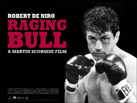 “Raging Bull” shows the true story of a Bronx boxer who rises and falls both inside and outside the ring. In typical Scorsese fashion, it contained 114 uses of the word “fuck”, according to imdb.com, and it tended to leave little to the imagination. He made an interesting choice by making 95% of the film black and white. The other 5% was a color 8mm camera that was meant to resemble home movies. The black and white gave it a different feel from some of the other boxing movies around that time, such as “Rocky”. It dampens the crudeness of the fighting to some extent as well. A lot of the blood and gore, which supposedly was done with Hershey’s chocolate, feels a little bit less intense in black and white.
One of the most interesting things I read about the film was how passionate De Nero was about making it. It was he who talked Scorsese into making the film, and De Nero played a big role in its production outside of his Oscar winning performance. He wanted to tell La Motta’s story to the world, and Scorsese helped him pull it off.
“Mad Hot Ballroom”
February 23, 2009“Mad Hot Ballroom” was an interesting look at how a ballroom dancing program in New York City public schools has had a positive impact on those 5th graders who participate in it.
The documentary told the story in a very effective way, cutting between footage of dance practice/competition with interviews with the kids and teachers who make it happen. It also did a great job setting the scene with shots of the neighborhoods where these kids are from. I thought transitions between all the different locations was one of the strengths of this documentary. The cinematography choices helped a lot in that regard. It was nice to end on a high note of the victory, but I would have liked a little more follow-up in the conclusion. Even just a montage of pictures with text and/or voice over right before the credits.
This 5th grade “Dancing With the Stars”, in essence, is an interesting topic for a documentary, and I thought the filmmakers told it well. It showed how much of an impact it has had on these kid’s lives, and it really captured the unique insights of the 10 year old mind well.
“Night Coffee”
February 19, 2009“Nighthawks” painting story…
“Lola Rennt”
February 16, 2009“Lola Rennt” has some of the most creative and unique cinematography and editing that I have seen in a film. It is fitting though, considering how unique the plot is and how the story is told.
Because the film uses roughly the same sequence three times, with a few changes each time, it needed to be visually exciting. It was able to achieve that through the creativity in the cinematography. Lola was filmed running from a lot of different perspectives to curb the monotony of sprinting down sidewalks for long periods of time. It also cut well with the fast paced music to build the suspense and tension of the moment. According to imdb.com, the average shot length was only about 2.7 seconds, and there were 1,581 transitions in just 71 minutes of action, which kept up with the fast pace of the movie.
I am a little bit surprised “Lola Rennt” did not recieve more Oscar attention, but foriegn films do tend to have a harder time. The editing and cinematography were at least on par, if not better, than a lot of American blockbuster films.
“The Life of Kevin Carter”
February 10, 2009
“The Life of Kevin Carter” shows how tragic the life of a photojournalist can be. Kevin Carter was talented enough to win a Pulitzer Prize for his work, but the scars he carried were incredible. Even more incredible, many of those scars were a result of outside critics. These critics chastised him for not being a Saint, when he was merely a journalist.
A good point was made in the film that his photos actually raised more awareness for the girl and those like her. That alone does more for her plight than anything he could have possibly done as an observer. It is sad that his photo that should have done nothing but enrich his life as journalist was one of the biggest influences on his decision to commit suicide.
Kevin Carter is a perfect example of how psychologically demanding his profession can be. People like him who risk their lives, in many cases, to bring the world powerful images need to be supported.
My Top 10 Photos
February 10, 2009My Top 10


